
Woot.com Landing Page
Our Amazon UX Team was tasked to create a single landing page for Woot.com (a quirky deals site owned by Amazon) that would help drive more traffic to their site. The page would show Woot Deals and live on the Amazon deals page, but users would be linked to Woot.com for further exploration and checkout. Designed in collaboration with Ashley Timm and Drew Koch.
Role Research, wire-framing, design
Deliverables A functioning landing page that connects Amazon to Woot.com. See the live site.
Research on Woot.com

How many people visit Woot?
An estimated 12.7 million visits in Sept 2014
They spend 3 min 19 sec spent on site, on average
Which pages are visited?
5 pages viewed per visit (on average)
33.75% to Woot.com
10.08% to Electronics.woot
8.76% to Computer.woot
7.78% to Sellout.woot
39.64% all other pages
How did visitors get Woot?
74.77% direct traffic
18.17% from referrals
4.04% through search
Where visitors go after they leave Woot
Amazon, Sears, Home Depot, Walmart, BestBuy, Youtube, ThinkGeek, Newegg, Bradsdeals, Touchofoder
Competitor Insights & Observations
We took a look at competitor deals site landing pages including Groupon, SlickDeals, Gilt City and LivingSocial to look differences in how deals are displayed and what type of metadata is surfaced to the user.


Curated/categorized lists help shoppers easily skip over irrelevant content.
Deals shoppers are browsers - they are here to shop for deals leisurely and at their own pace.
Deals shoppers often don't know what they are looking for and are open to getting suggestions from sites.
Because deals change often, shoppers return to the site to check for new or expiring deals.
Initial Sketches
During the sketching and ideation phase, we looked at different ways to show deals, trying to find a balance between showing deal categories but also deals that live within a category. Woot’s multiple category sites as well as unique deals of the day and deal events make for an interesting and unique ecosystem for their users. For that reason, it was important to establish these patterns clearly, so when users transitioned to Woot.com from the Woot landing page on Amazon, they would be able to continue navigating on Woot.com without issues. Also, because Woot.com would handle the checkout process, it made sense for this landing page to push users towards Woot as soon as possible.
We had 4 design challenges with this project:
1) Understand Woot's multi-site experience and condense it down to a single landing page
2) Clearly display the deal types and deal metadata
3) Communicate when user is leaving the Woot landing page and going to Woot.com for purchase
4) Incorporate the fun, tongue-in-cheek aspects of Woot.com to communicate the brand (ie, monkey chat)


Understanding the Woot.com User Journey
We charted how users look at deals and move through to purchase on Woot.com in order to understand how our Woot Widget would connect users seamlessly to Woot.com after they leave our widget page.

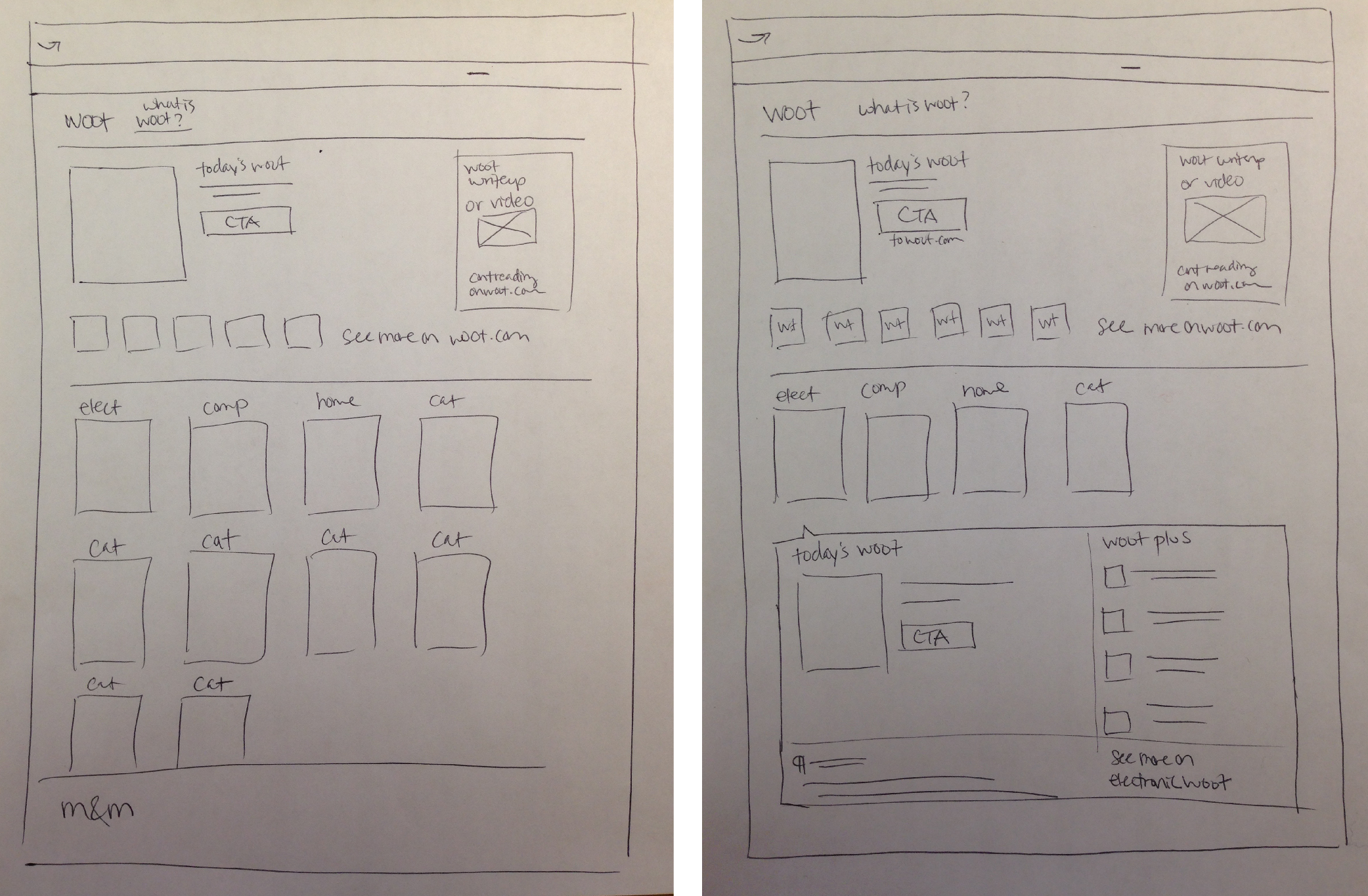
Rough Wireframes
To distill Woot down to one landing page, it would be necessary to be able to communicate the Woot ecosystem at a single glance, with as few clicks or scrolls as possible. Showing the major Woot deal of the day, and then showing each Woot category would give the user a sense of the different departments of Woot, and then any further clicks would drive to the Woot.com site. Clicking on the category tiles would expose the daily deal of that Woot category as well as Woot Plus deals, which would link off to Woot.com. The Monty & Mortimer monkey was a fun brand element that we felt should be included in the experience so we made room for it at the bottom of the page, to surprise and delight users who scrolled to the end of the page.
Mid-fidelity wireframes to final site experience


An extra delightful moment: Monkey Chat
Even though Monkey Chat wasn’t a deliverable requirement from the Woot team, it was such a fun and delightful aspect of the Woot brand that we made the extra effort to incorporate this into our final handoff.
There are 2 ways to access the daily monkey conversation:
1) Click on the monkey bubble in the top left hand corner
2) Scroll to the bottom and click the button on top of the monkey illustration.


